Table of Contents
2.1.2. Do not justify the text
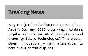
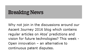
Text must not be justified (aligned to both the left and the right margins).
Examples
In the first example, the justified text leads to irregular and large gaps between words, which can be harder to read.
Related recommendations
- Previous recommendation: 2.1.1. Keep accents on uppercase letters
- Next recommendation: 2.1.3. Make sure that the typefaces can be integrated in text format

