Table of Contents
3.1.1. Make sure that there is sufficient contrast between the content and the background or propose an alternative with contrast
The contrast between the colours and the background must be sufficient for all items present (text, images, videos, etc.).
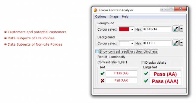
To test the contrast, you could use, for example, the Contrast Analyser tool for Windows and Mac OS, which you can download free at Contrast Analyser, disponible en libre téléchargement pour Windows et Mac OS.
 According to this tool, the contrast ratio is considered as sufficient if it reaches the standard AA.
Be careful when using shading or patterns as background for content.
If it is not practical to optimize the contrast, then you can create alternative style guidelines that offer sufficient contrast.
Alternative style guidelines do not necessarily push the contrast to the limits (for example, black on white, or white on black), but provide rules so that the association of colours is optimized satisfactorily.
Examples


in this example, alternative style guidelines that are sufficiently contrasted
can be activated from the button “Change the page contrast”.
Some useful tools
Recommendations associées
- Previous recommendation: 2.2.1. Associate text with each ambiguous symbol
- Next recommendation: 3.2.1. Make sure that information is comprehensible, even if the colours are absent


