Table of Contents
1.1.3. Make the current position visually different in the menus
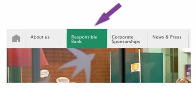
In each menu, the current item must have a different appearance.
Tip
It is also highly recommended to have a different appearance for the mouse-over of menu items.
It is also highly recommended to have a different appearance for the mouse-over of menu items.
Examples

In this example, an arrow pointed downwards indicates the menu item that is opened (“Members’ area”, while a colour background and an arrow pointing to the right indicate the current page (“Bonus points”).

Example of a background colour indicating the currently selected menu tab
Related recommendations
- Previous recommendation: 1.1.4. Make sure that the navigation is visually consistent


