Table of Contents
7.2.2. Provide an explicit button text for each button
An explicit button text must be provided for each button. The purpose of the button must be easily understood just by reading the button text, even if it is read out of context.
Button texts with the following text should therefore be avoided:
- “OK”.
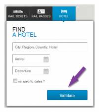
- “Validate”.
- “Confirm”.
- Etc.
They should be replaced by button texts such as:
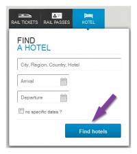
- “Register”.
- “Go to step 2”.
- “Confirm payment”.
- Etc.
Note
If it is not practical to add a button text for some buttons (lack of space in the mock-up, for example), there are other solutions that can be used later in the development phase (adding tooltips, for example). Nevertheless, this is a compromise solution that is less effective than directly optimizing the button text.
If it is not practical to add a button text for some buttons (lack of space in the mock-up, for example), there are other solutions that can be used later in the development phase (adding tooltips, for example). Nevertheless, this is a compromise solution that is less effective than directly optimizing the button text.
In this example, the image button represents a magnifying glass. It will be made accessible during the technical phase.
Examples
In this example, the “Validate” button has been replaced by a “Compare” button, which is more precise
Related recommendations
- Previous recommendation: 7.2.1. Provide a submit button at the end of each form
- Next recommendation: 7.3.1. Clearly indicate mandatory fields


